 .Modelica.UsersGuide.Conventions.Icons .Modelica.UsersGuide.Conventions.Icons
The icon of a Modelica class shall consider the following guidelines:
The main icon color of a component shall be the same for all components of one library. White fill areas of an icon shall not be used to hide parts of an icon, see #2031. In the Modelica Standard Library the following color schemes apply:
| Package | Color RGB code | Color sample |
|---|---|---|
| Modelica.Blocks | {0,0,127} |  |
| Modelica.ComplexBlocks | {85,170,255} |  |
| Modelica.Clocked | {95,95,95} |  |
| Modelica.StateGraph | {0,0,0} |  |
| Modelica.Electrical.Analog | {0,0,255} |  |
| Modelica.Electrical.Digital | {128,0,128} |  |
| Modelica.Electrical.Machines | {0,0,255} |  |
| Modelica.Electrical.Polyphase | {0,0,255} |  |
| Modelica.Electrical.QuasiStatic | {85,170,255} |  |
| Modelica.Electrical.Spice3 | {170,85,255} |  |
| Modelica.Magnetic.FluxTubes | {255,127,0} |  |
| Modelica.Magnetic.FundamentalWave | {255,127,0} |  |
| Modelica.Magnetic.QuasiStatic | {255,170,85} |  |
| Modelica.Mechanics.MultiBody | {192,192,192} |  |
| Modelica.Mechanics.Rotational | {95,95,95} |  |
| Modelica.Mechanics.Translational | {0,127,0} |  |
| Modelica.Fluid | {0,127,255} |  |
| Modelica.Media | none | |
| Modelica.Thermal.FluidHeatFlow | {0,0,255} |  |
| Modelica.Thermal.HeatTransfer | {191,0,0} |  |
| Modelica.Math | none | |
| Modelica.ComplexMath | none | |
| Modelica.Utilities | none | |
| Modelica.Constants | none | |
| Modelica.Icons | none | |
| Modelica.Units | none |
The icon of a Modelica class shall not be significantly greater or smaller than the default Diagram limits of 200 units x 200 units. These default diagram limits are
If possible, the icon shall be designed such way, that the icon
name %name and the most significant parameter can be
displayed within the vertical Diagram range of the icon.
(a) 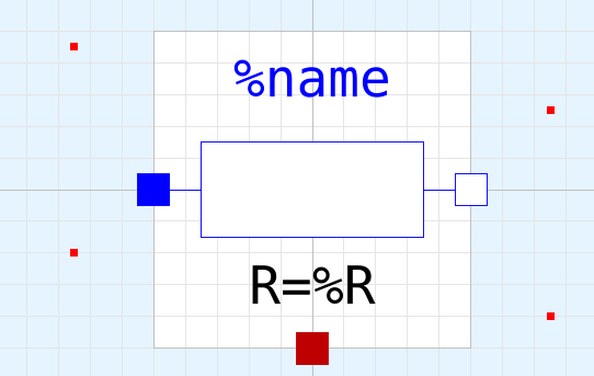 |
(b) 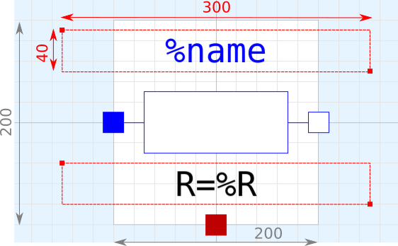 |
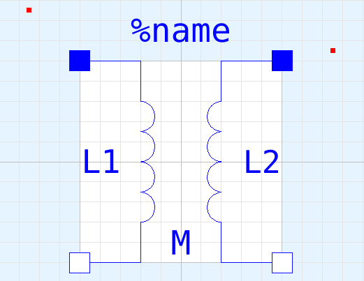
The component name %name shall be in RGB (0,0,255)
blue color.
The text shall be located above the actual icon. If there is enough space, the upper text limit of the component name shall be 10 units below the upper icon boundary, see Fig. 1.
If the icon is as big as the entire icon range of 200 units x 200 units, e.g. in blocks, the component name shall be placed above the icon with vertical 10 units of space between icon and lower text box, see Fig. 2.
 |
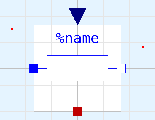
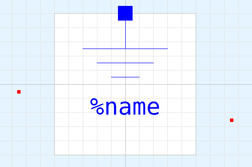
If there is a connector located at the top icon boundary and it is obvious that this connector influences the model behavior compared to a similar model without such connector, then a line from the connector to the actual icon shall be avoided to keep the design straight, see Fig. 4. If it is required to use a line indicating the connector dependency, then the line shall be interrupted such that this line does not interfere with component name.
 |
In some cases, if there is not alternative, the component name has to be placed below the actual icon, see. Fig. 4.
 |
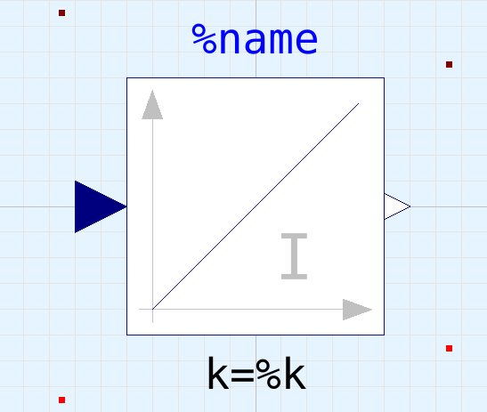
One significant parameter shall be placed below the icon, see Fig. 1 and Fig. 2. The parameter name shall be RGB (0,0,0) black color.
The parameter text box shall be placed 10 units below the actual icon.
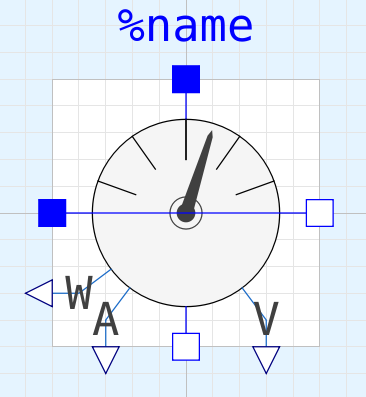
Physical connectors shall always be located on the icon boundary. Input and output connector shall be placed outside the icon, see Fig. 2 and Fig. 3. Preferred connector locations are:
 |
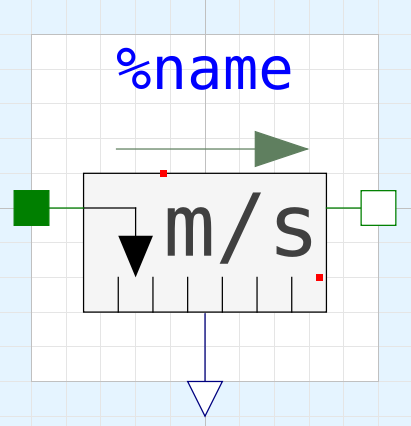
Based on #2628 the following guidelines for the design of sensors apply:
{{-30,-10},{30,-70}}
(Fig. 6(a)){{-50,-12},{50,-48}}
(Fig. 6(b)), depending on the better
readability{{-24,20},{66,-40}}
(Fig. 7)(a) 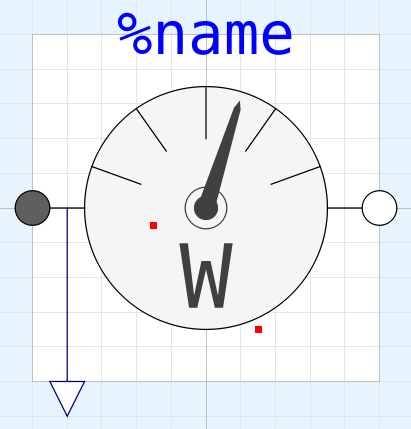 |
(b) 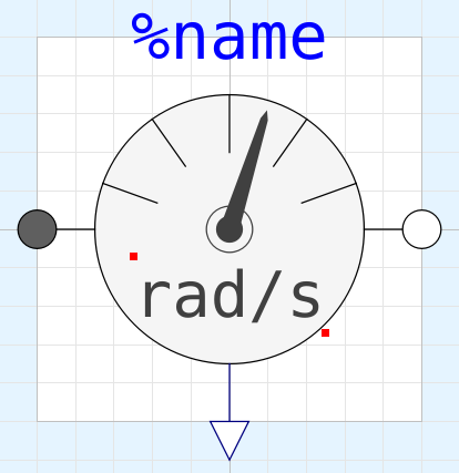 |
 |
 |
The diagram layer is intended to contain the graphical components, and if there are no graphical components it shall be left empty. In particular do not make the diagram layer a copy of the icon layer. Graphical illustrations shall not be added in the diagram layer, but can be added in the HTML documentation.