The figures below show the results from several cell-level examples of FCSys. The models were simulated using Dymola 2014. The plots were generated using ModelicaRes. For more information, please follow the links to the associated models. For discussion and more results, please see [Davies, 2014].
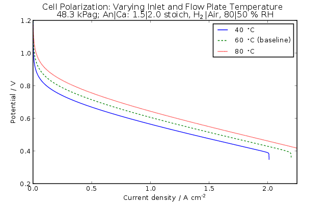
Figure 1: Polarization curves of the cell with various inlet
and flow plate temperatures (FCSys.Assemblies.Cells.Examples.TestStand).
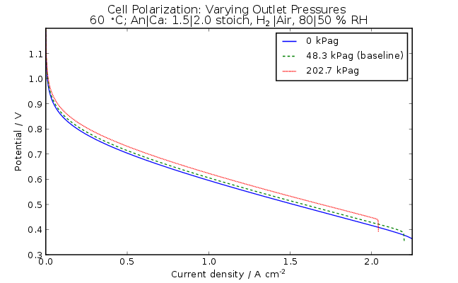
Figure 2: Polarization curves of the cell with various outlet
pressures (FCSys.Assemblies.Cells.Examples.TestStand).
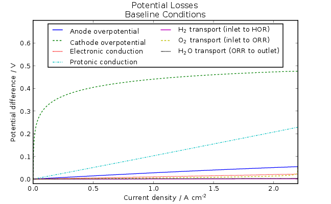
Figure 3: Potential losses during the baseline polarization
test (FCSys.Assemblies.Cells.Examples.TestStand).
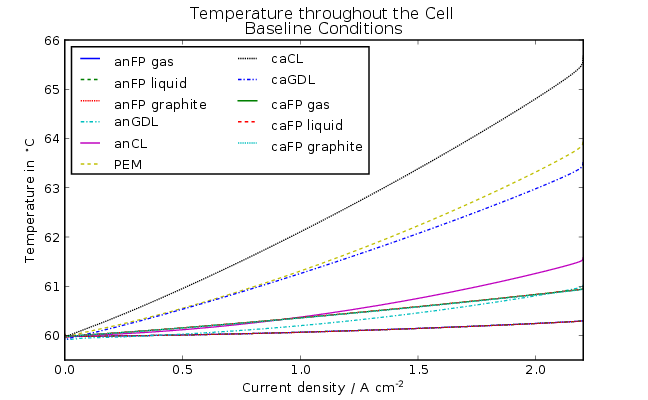
Figure 4: Temperature throughout the cell during the baseline
polarization test (FCSys.Assemblies.Cells.Examples.TestStand).
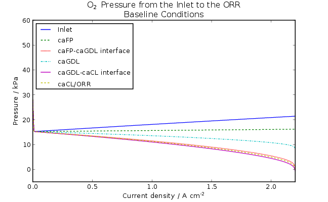
Figure 5: Oxygen pressure during the baseline polarization
test (FCSys.Assemblies.Cells.Examples.TestStand).
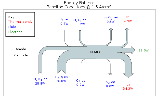
Figure 6: Energy balance of a 50 cm2 cell at
1.5 A/cm2 during the baseline polarization test
(FCSys.Assemblies.Cells.Examples.TestStand).
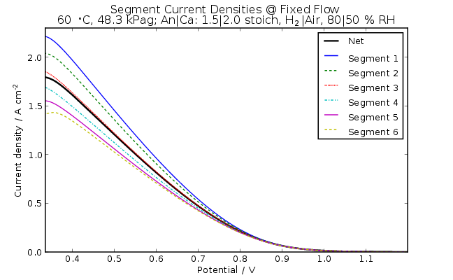
Figure 7: Polarization of cell segments with fixed reactant
flow rates (FCSys.Assemblies.Cells.Examples.TestStandFixedFlowSegmented).
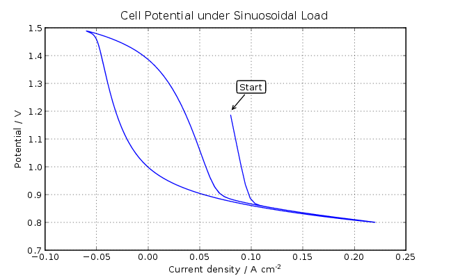
Figure 8: Polarization under sinusoidal, reversing load
(FCSys.Assemblies.Cells.Examples.TestStandCycle).
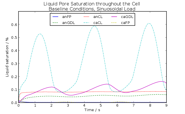
Figure 9: Liquid pore saturation under sinusoidal, reversing
load (FCSys.Assemblies.Cells.Examples.TestStandCycle).